Byggeprojekt.dk is a digital collaboration platform for construction professionals. The platform originated with a single core module—Files—and expanded over time to include Review, Tender, and more. However, this growth introduced significant UX and architectural issues.
We led a complete platform redesign with a modern UI, clearer structure, and a scalable foundation that supports future growth.
Problem statement
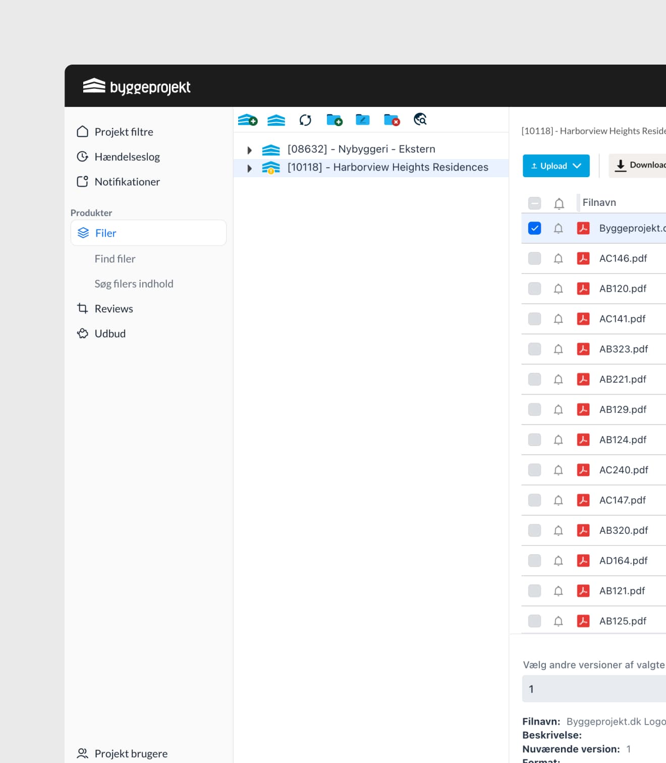
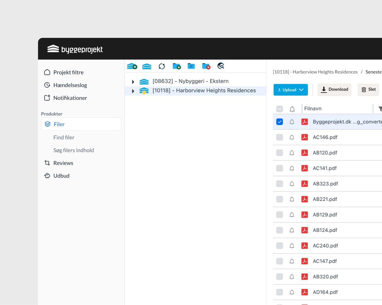
Projects were embedded within the Files module.
Other modules were added later, but tightly coupled to Files.
No clear separation between global tools and project-specific modules.
Navigation was confusing, especially for new users.
The platform lacked a unified design system and modular thinking.
Hypothesis
If we redesign the platform around a modular structure with clear separation between global and project-level views, supported by a modern design system, then:
Users will navigate the platform more confidently.
Feature adoption and discoverability will improve.
Onboarding and orientation time will decrease.
The platform will better support future modules and user roles.
Goals
Scalable Foundation
Introduce a modular architecture for scalable growth.
Unified Design Language
Build a new design system to improve consistency and development efficiency.
Context-Aware Navigation
Create a clear separation between global and project-specific contexts.
Smarter Access Control
Establish role-based access and contextual visibility of modules.
Audit & Discovery
UX audit of the entire platform.
Reviewed analytics, heatmaps, and support tickets.
Conducted stakeholder and user interviews.
Defining the Core Issues
Projects and files were conflated.
Navigation lacked hierarchy and context.
Users didn’t understand which modules were active in a given project.
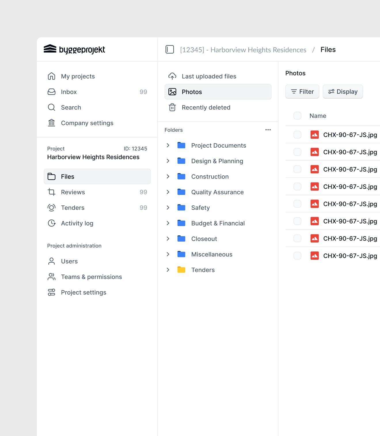
Information Architecture Redesign
Split navigation into two parts:
Global nav (left sidebar): My Projects, Search, Inbox, Company settings
Project Nav (contextual sidebar): Files, Review, Tender, Project settings
Key UX Improvements
My Projects
Central hub to manage all projects. Search, filter, pin, and favorite projects.
Modular Project Navigation
Only shows modules active in the current project. Highlights project name and ID at the top.
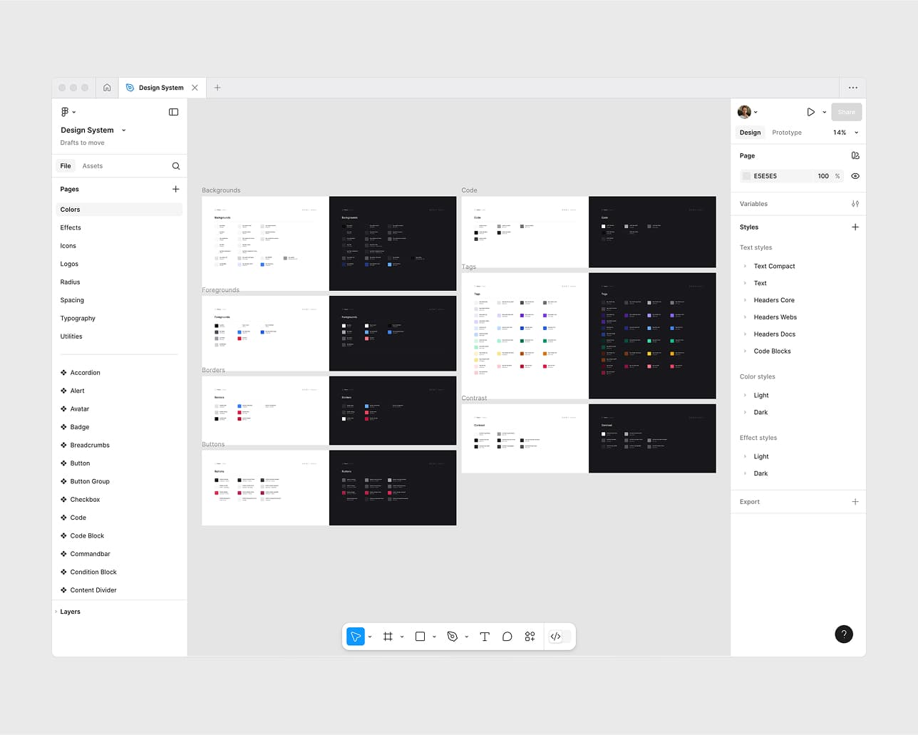
New Design System
Built in Figma with tokens and variants. Clean, modern UI: cards, tabs, badges, segmented controls.
Role-Based Module Access
Reworked permissions UI per project. Users see only what they need—nothing more.
Results
The redesign significantly improved usability, orientation, and long-term platform scalability. Users now navigate with greater confidence, find relevant tools faster, and engage more deeply with available modules. The new structure reduced confusion, sped up onboarding, and laid the foundation for upcoming advanced features like planning and budgeting.